Veriff’s New Visual Brand Identity
A brand identity goes beyond what a company does and sells. It encompasses the core message of an organization, who it is meant for, and stands the test of time and change that inevitably comes with growth.
David Castillo
Starting with a team of 18 last year, Veriff now handles millions of sessions a year. Our ambitious vision of a world where honest people were easily trusted and companies don’t lose sleep over fraud is rapidly becoming a reality.
But despite being the new, up-and-coming industry-leader, our brand wasn’t recognizable. It became clear that growth alone was not enough to make our presence known, at least not at the scale we need to make an impact.
To go from millions to billions of verifications as planned, we needed to change the way we communicated our brand.
It was time for a new look
“Design is the silent ambassador of your brand.” - Paul Rand, Art Director and Graphic Designer
Last week we launched Veriff Station, our new and improved verification platform that makes Veriff accessible to companies of all sizes. Flexible plans and pricing are what the identity verification industry was missing, and this was a huge step in our long-term vision for a fraud-free world.
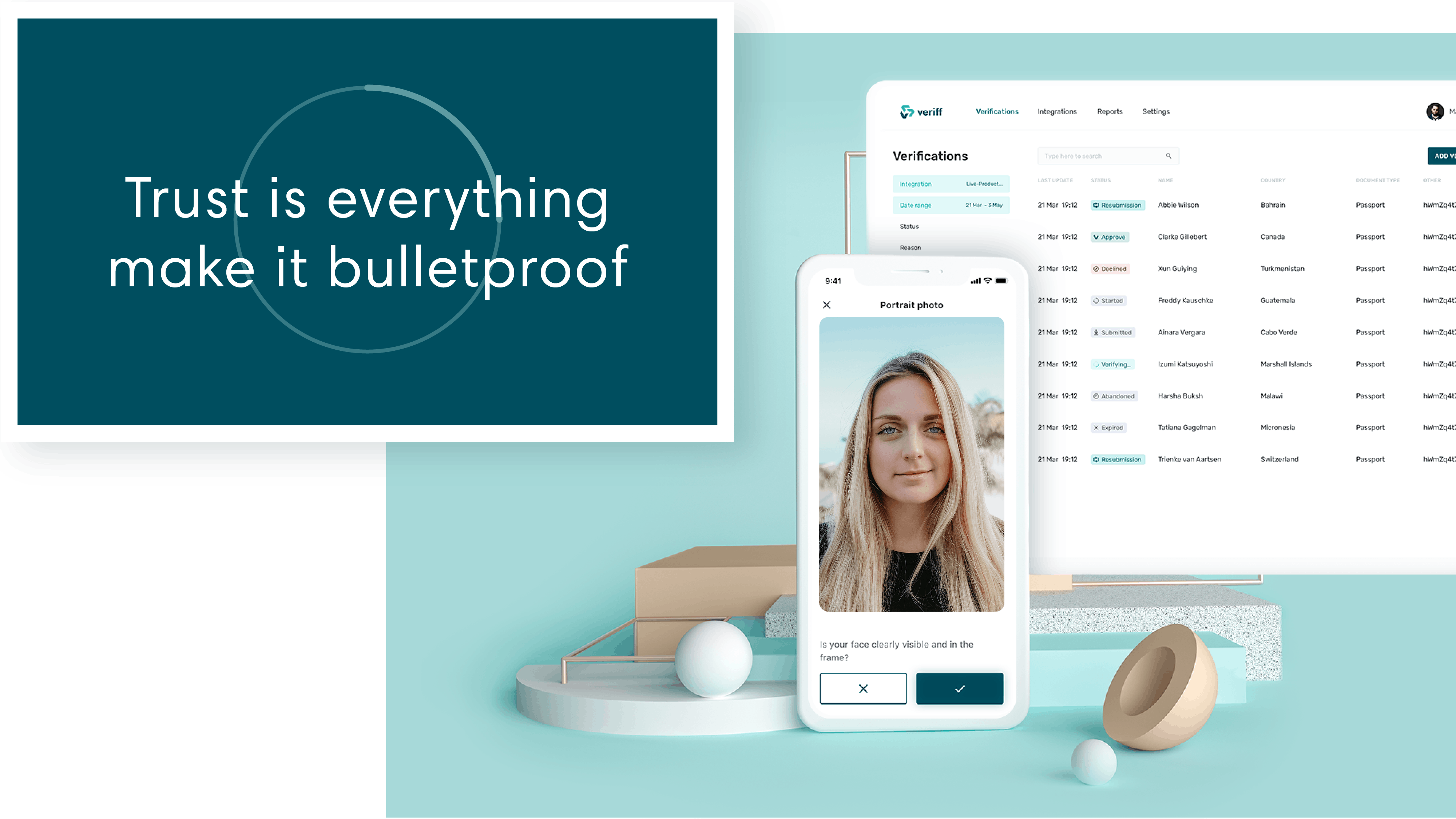
In addition to a new platform and pricing model, our product and website were treated to a carefully crafted makeover. We wanted the look and feel of our product and marketing materials to match the boldness of our purpose and vision, and to be memorable and unique while still staying true to the roots of our story.
That was how our new brand identity was born.
What is a visual brand identity?
Behind every memorable visual brand identity, there is a company philosophy and a visual system. Philosophy covers our company purpose, from what we are doing to achieve and how we do it. The visual system encompasses the set of visual elements and rules that, when followed, create a consistent look and feel.
Among other changes, our logo was made more prominent, and we introduced a stronger primary color to our existing color palette. But before we dive into what changed, it is important to mention the process behind the look.
The process of creating a visual brand identity
Aesthetics aside, the process of making small but collectively radical changes to our brand calls for a strategic approach. And it all starts with defining the message you want to share with the world versus the solution you are selling and it’s larger purpose.
Step 1: Define your brand message
Veriff’s mission is to protect honest people in the digital world. We do this by creating optimized identity verification flows that are as easy to implement for companies as they are for end-users to complete. But our brand message goes beyond what we do.
Our message encompasses the motivation behind all past, present, and future efforts. It leaves room for us to adapt and evolve while still acting as our North Star. This flexible certainty is what differentiates a strong message from a weak one.

Step 2: Identify the recipients of your message
Every message needs a listener. However, the target audience for a brand message may change depending on the current strategic goals.
The release of Veriff Station is a huge step towards our long-term vision for a world where online trust is unshakeable. When working on our visual brand identity, we knew that while our message is intended for the world, the 4,000+ too-small companies we had to turn down in the past are the recipients who would benefit most from our message now.

Step 3: Define how you want the message delivered
This is your brand personality; the delivery of the message to the right listeners is what separates you from the herd or camouflages you in the forest of “market disruptors”.
The premise behind our rebranding efforts was to reflect a sense of protection and security, while also being bold. Veriff is also user-focused, and so a friendly approach to protecting people online is also something our look needed to reinforce.
We picked up where the agency behind our previous visual brand identity, Haiku, left off, keeping what worked and taking other elements to the next level.
Bringing our philosophy to life
Machine learning software and high-converting software aside, Veriff is here to protect good people against fraud, and make it easier for them to be trusted online.
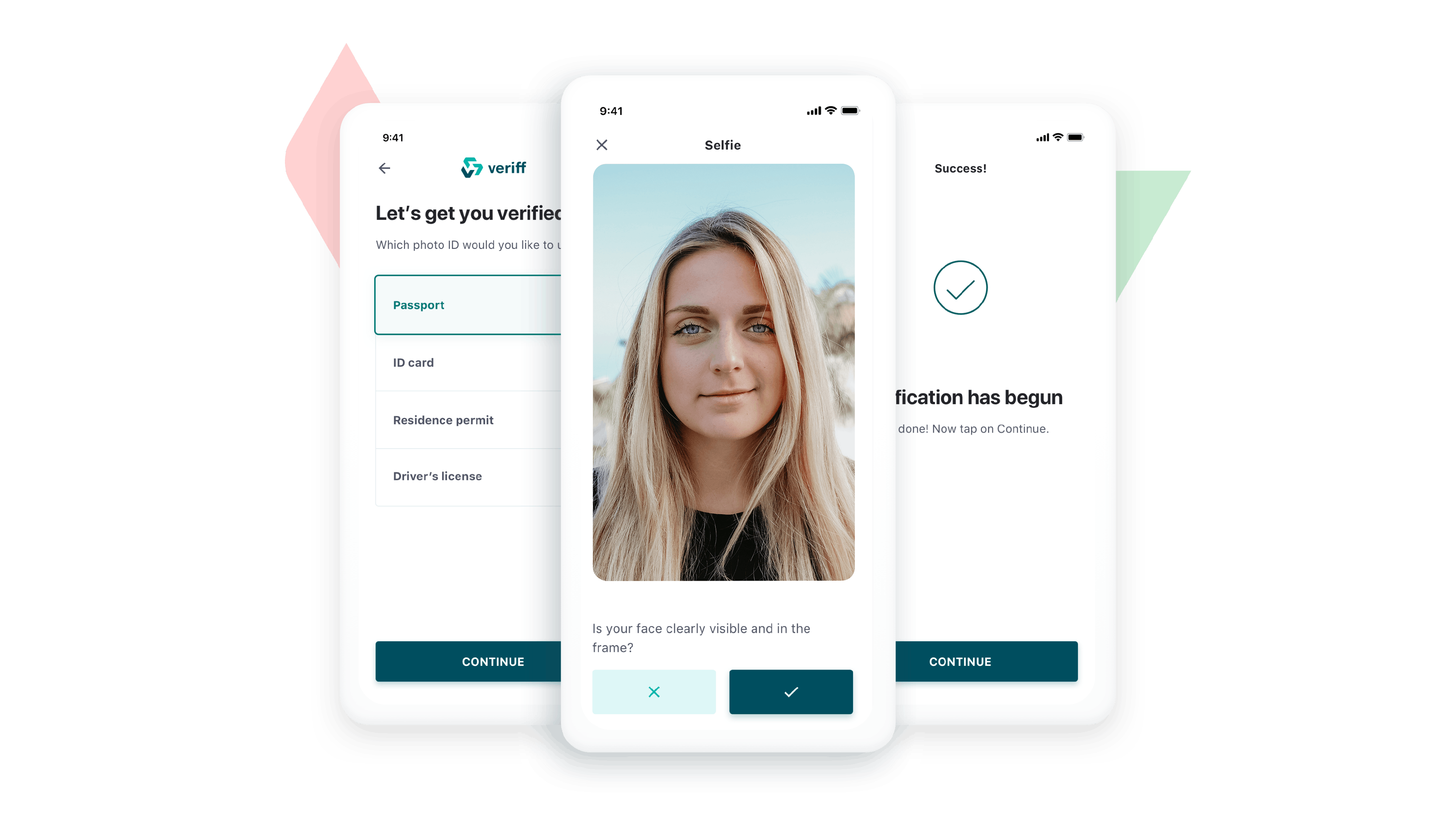
Transparency and honesty are how we do this. This is shown visually in the way elements in our website are spaced apart and the minimal designs in our verification flow. Complexity creates confusion and confusion fuels distrust. Veriff was made to make things clear and simple, and a clean look is what complements our message best.
The new Veriff logo
The first Veriff logo was made in 2015, by one of Veriff’s first designers, Heidi Taperson. From the very beginning, our logo was easy to recognize and symbolized the verification process.
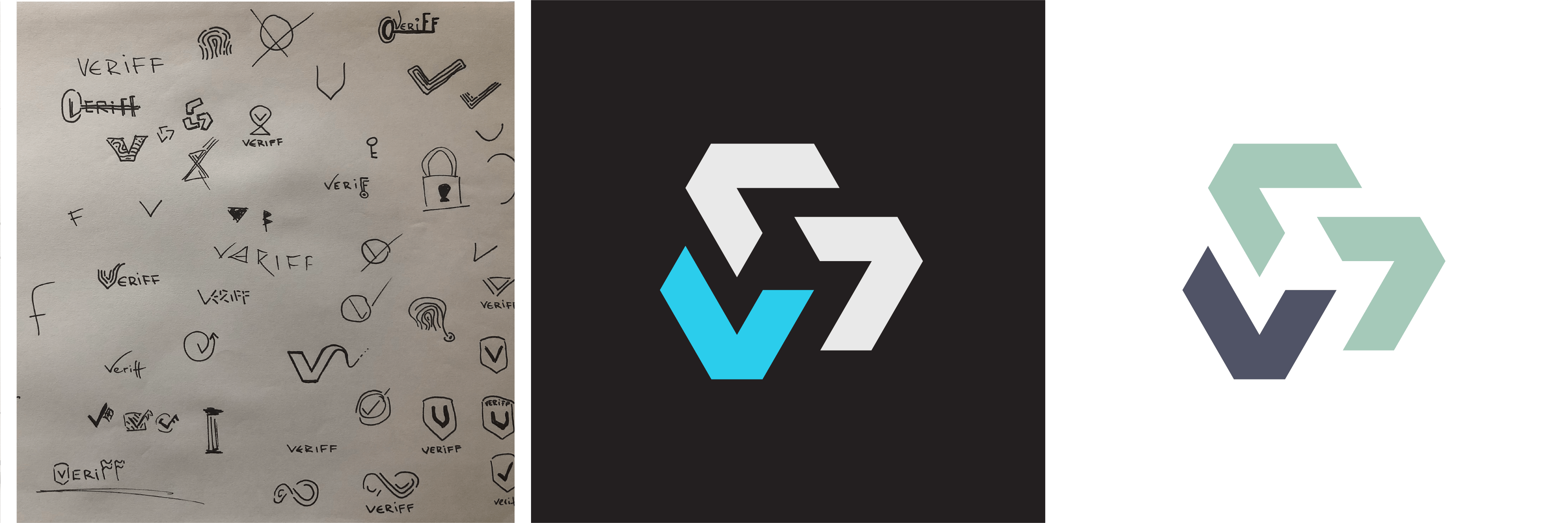
When working on our new visual brand identity, we decided to keep the essence of the same symbol. We only made a few adjustments in the alignment of the elements, and softened the edges to give the logo a sense of movement and friendliness.

While it is deceptively simple, our logo tells a complex story. Making sure that someone is who they say they are is no easy task, especially online. It calls for a strong infrastructure and set of processes. In our case, we use AI, machine learning, and eagle-eyed specialists to make accurate decisions about people’s identities.
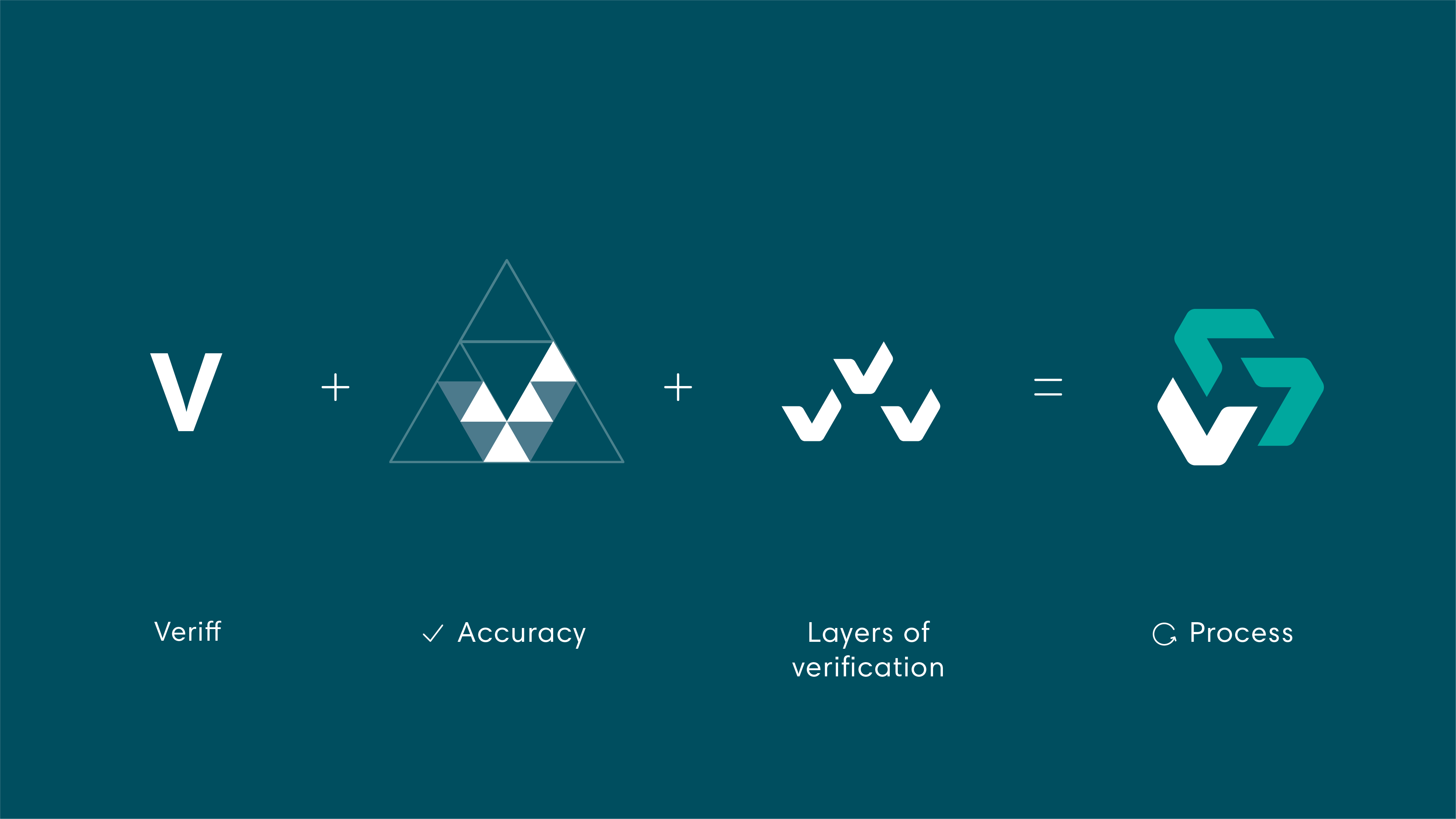
Veriff makes it possible to be trusted anywhere in the world, which is why the base layer of the symbol is made up of meticulously positioned equilateral triangles. Together, many small elements make up a larger whole, with accuracy and precision being the glue that holds it all together.

The new Veriff colors
The goal of our new color palette was to add a primary color that would make us easily identifiable, We did not want to scrap our soft, pastel palette, so our main challenge was to select a primary color and pastel palette that would work in harmony.
We ultimately found the color we were looking for, and we call it Atlantis. As a secondary color, we choose aquamarine. This is only used for highlighting, backgrounds, and for illustrative purposes.
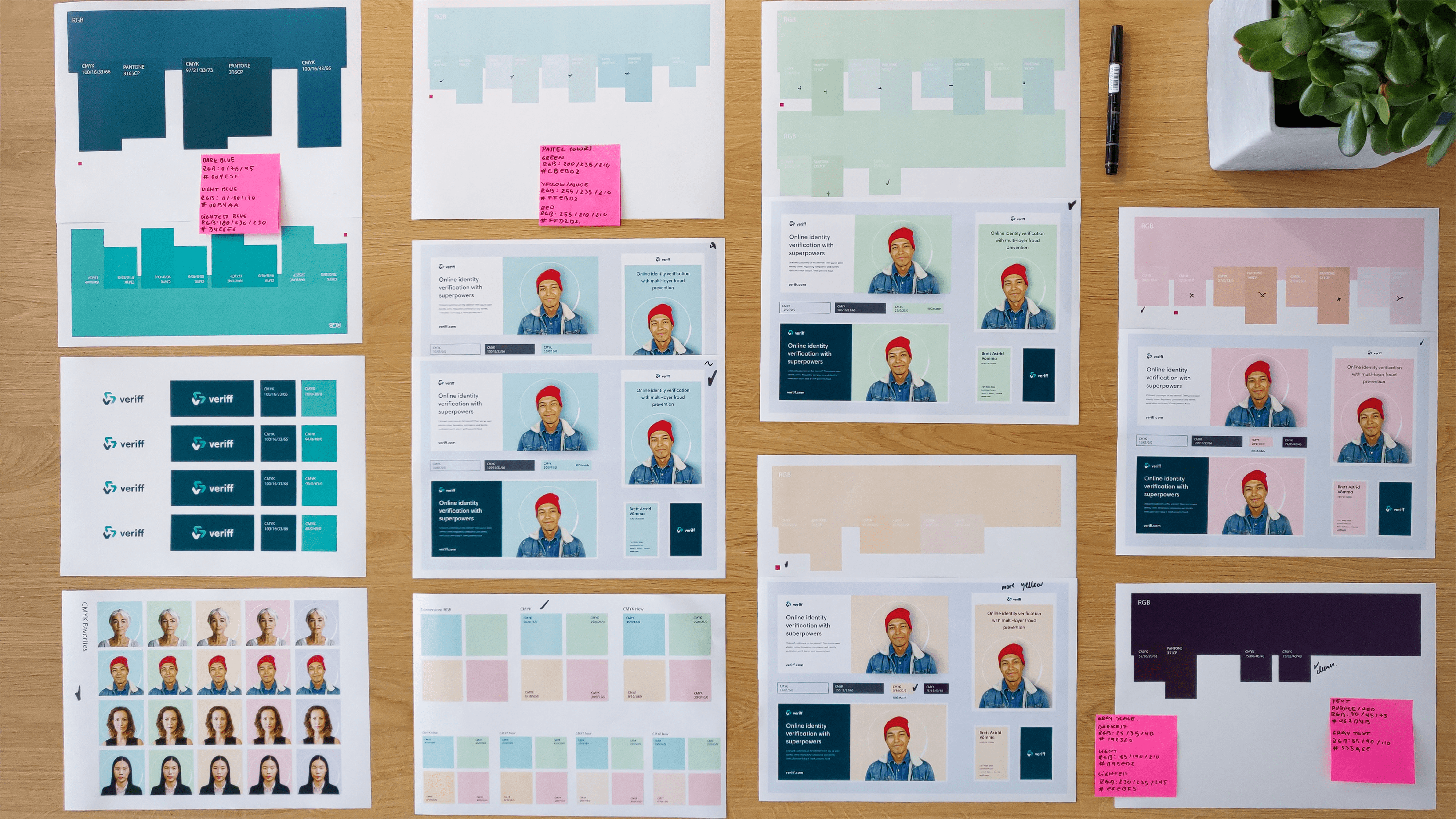
The pastel shades are subtle and add a visually appealing touch without being too distracting. Combined with a prominent color used sparingly, the effect is recognizable without being overwhelming for our users.
Implementing Veriff’s visual brand language
Once there was a system in place, it was time to put all the visual elements together. Our new logo, font colors, photography, and illustrations need to be placed throughout our product, merchandise, and marketing materials both online and off.
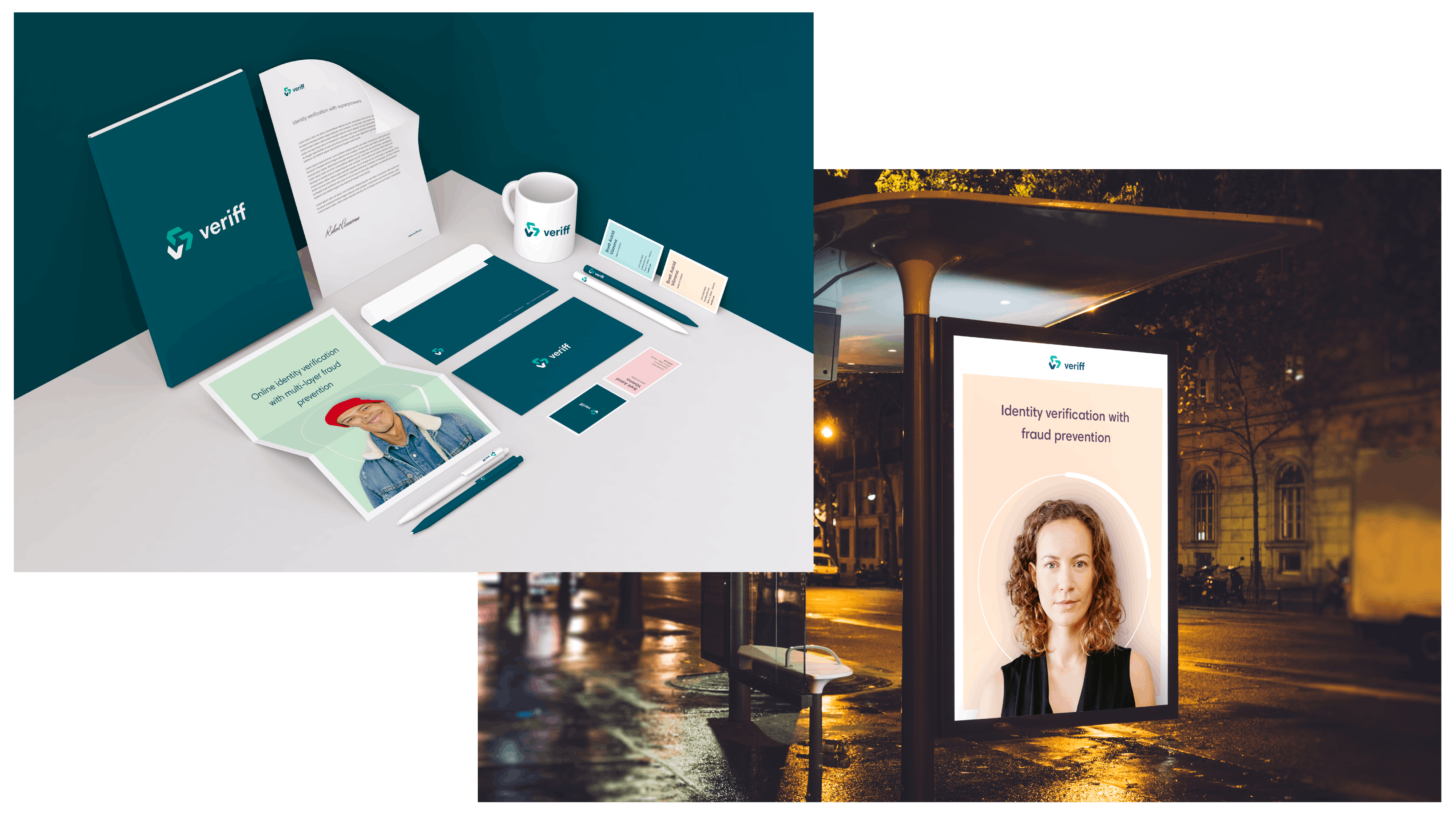
Growth and change go hand in hand. While our current visual brand identity is more in line with our brand message and audience, maintaining a coherent visual brand identity requires continuous revision and improvement. Feedback is always great, so let us know what you think about the new look on Facebook, Instagram, or Twitter.

David Castillo is one Veriff’s key designers, and the brains behind our new visual brand identity. His user-centric approach results in visual identity systems that inspire collaboration among designers, and the illustrations and graphics you see across our website can be credited to his love for visual communication.
Interested in a career with Veriff? Learn more about our people and the application process.


